Visualizing On-Chain Data (Part 1)
The Credmark Terminal and FTX
Matthias Knauth
2022/12/01
On-chain data is very powerful. It contains the truth about everything that has ever been immutably written in digital stone. But it is a lot of data. Our Credmark ETL has thus far recorded 16 GB of data.
So if you are looking to understand this massive amount of data, you need to use tools. And one of the most efficient tools to understand whopping amounts of data is to visualize it and look for patterns.
At Credmark we organize and produce data, but we don’t build visualization tools. Nonetheless, we wanted to see it ourselves, and we wanted to show others an example of the data we produce. We wanted to connect all the dots to show what we have to offer. Ideally, we wanted to inspire people to think even further about the possibilities that lay beyond the raw data.
For us, it was important to demonstrate the blend between on-chain data and useful risk analysis for DeFi. So we built a showcase, the Credmark Terminal.
Not Another Dashboard!
Sure, there are dashboards out there….there are thousands of them. So why release yet another one?
Well, simple. Ours is different. And we don’t only mean the nice design and the interactivity. Most importantly, the data that drives this dashboard is different. This data that has not been seen in any other dashboard. This data is the product of financial risk analysis models that use on-chain data as their source. These models were built and deployed on the Credmark Platform.
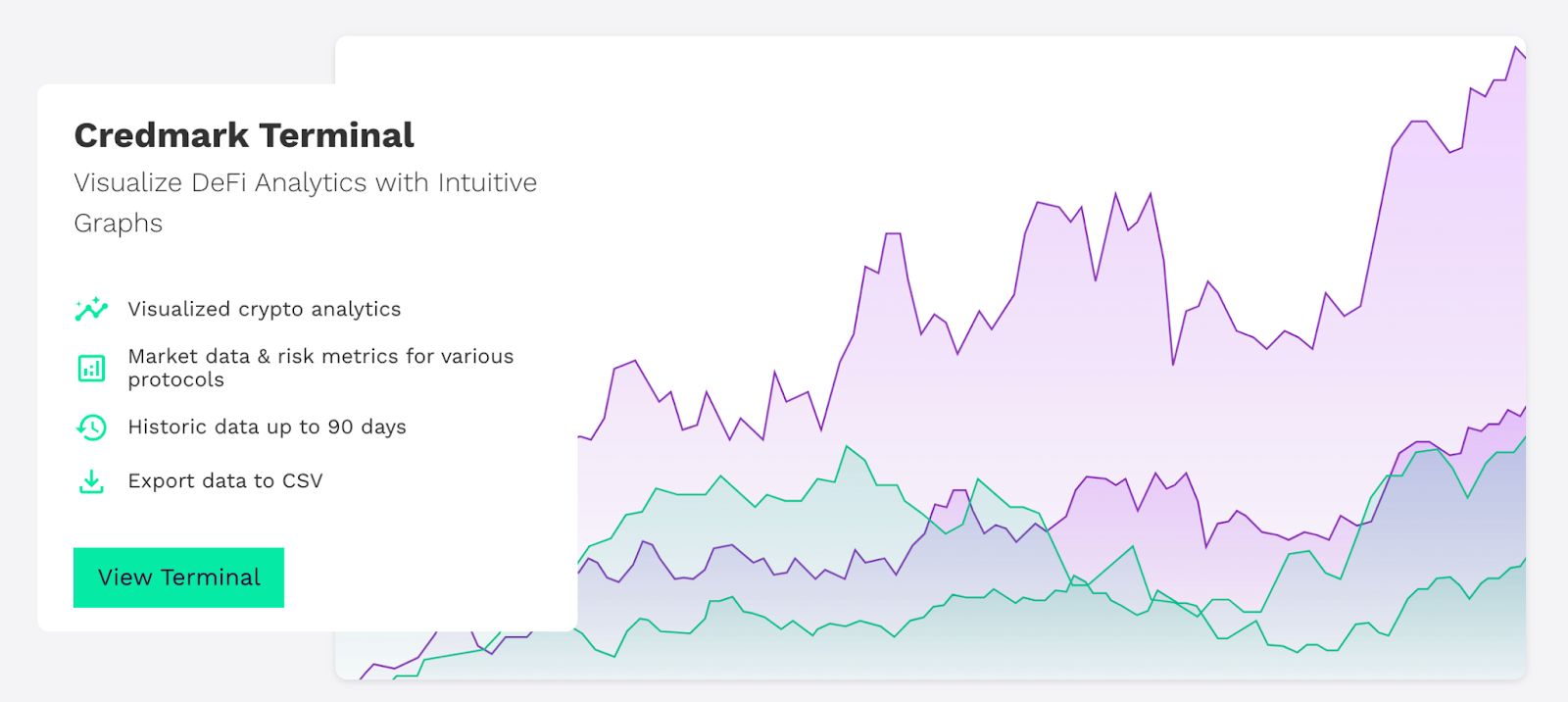
As we are very proud of what is possible with the Terminal, we want to get a step further and dive into some “real world” examples, to show how you can visualize our data from the Terminal to gain insights into what is going on in the markets. This data, of course, is also directly available on our platform or through one of our APIs.
We will now highlight some of the metrics we have in the Terminal. The first one will be the Balance Ratio.
Looking at the FTX drama on-chain
2022 is a weird time to be in Crypto. Some heavy macro events pulled us down. We had the Terra / Luna debacle as well as the fallout of 3AC, BlockFi, Voyager, Celsius….but the biggest 💩 of all was set to come in the form of SBF and his Alameda / FTX empire.
While FTX was a centralized exchange (CEX), they (and Alameda even more) had their claws in DeFi as well. And as soon as they leave their centralized orderbooks and OTC trading desks, and enter the main stage on the blockchain, they leave traces. And we are able to pick them up.
Liquidity is king... but for which tokens?
So with every crisis there comes the liquidity crunch. Degens flew out from risky assets into some safe havens like USDC or DAI. But what about other so-called stablecoins? Remember that Alameda was a major user of Abracadabra, and they used FTT (FTX´s own utility token) to mint Magic Internet Money (MIM). And they minted A LOT. As on November 3rd, more than 35% of the outstanding MIM supply was backed by FTT¹.
As the rumors about Alameda surfaced and CZ officially announced his selloff plan for FTT, users flew from MIM. And you could follow it live on the biggest decentralized stablecoin exchange of all….Curve.
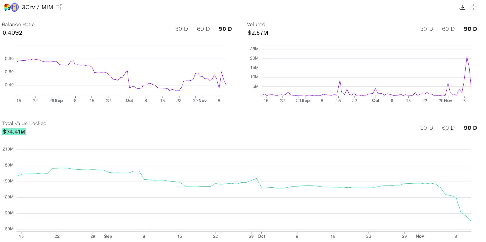
Here we see some direct insights that the Terminal offers us. We see the trading volume and total value locked (TVL) in the 3Crv/MIM pool but, most importantly, we see the Balance Ratio on the top left.
In short, the Balance Ratio shows how unbalanced the pool is. A number close to 1 means perfectly balanced, so if there are two assets in the pool, each one makes up roughly 50%. When there are 3 assets in the pool and each individual one is about 33%, you would consider this pool also perfectly balanced and the Balance Ratio would show a number close to 1.
The Balance Ratio of the 3Crv/MIM pool reached a low of 0.3535 on Nov 8. The Balance Ratio recovered recently, but the Curve pool is still very unbalanced towards MIM with over 86%.
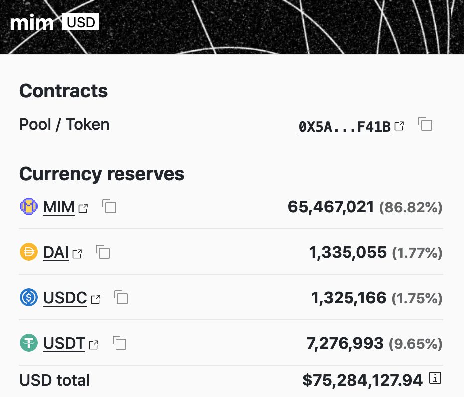
Curve 3Crv/MIM Pool stats²
So what does this mean?
People were selling MIM against the other stablecoins of the pool, thus causing sell-pressure against the peg of MIM. This finally caused MIM to depeg to $0.95 on Nov 8th but soon restored the peg again.
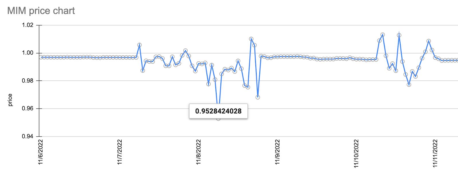
MIM Chart 6-11 Nov³
But not only was MIM under pressure, so was USDT, which raised concerns worth looking at. The 3Pool on Curve (DAI/USDC/USDT) shows some significant imbalance as well, with a share of 13.9% DAI, 12.5% USDC, and 73.5% USDT, instead of the ideal 33% split.
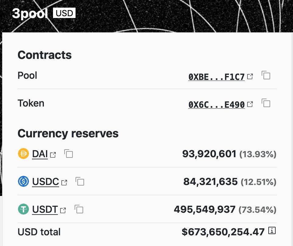
Curve 3pool stats⁴
You will see the change in the Balance Ratio chart for the 3pool in the Terminal as well as rise in the trading volume. The Balance Ratio tanked from nearly 1 to 0.3634 while the Trading Volume spiked from below $100m daily volume to over $2b.

You can draw your own conclusions from these charts, but in general, investors seemed to limit their exposure to USDT and once again favor USDC and DAI instead.
Balance Ratio Conclusions
Imbalances in Curve pools should always be watched closely as they are indicators that something is going on in the markets. So every savvy investor should pay attention to this very important metric and Credmark´s data, available via our APsI or the Terminal, should be your go-to source.
Footnote
¹ Insights from the FTX implosion (Bankless Substack)
² Data retrieved from Curve.fi/#/ethereum/pools/mim/deposit
³ Chart based on price data from Credmark Token API
⁴ https://curve.fi/#/ethereum/pools/3pool/deposit
About Credmark
Credmark runs a financial modeling platform powered by reliable on-chain data. We curate and manages DeFi data making it available via API and the Snowflake Marketplace around the globe and across industries.
Our community of quants, developers, and modelers actively build models for the DeFi community by leveraging our data API and tools. Join the growing community and together we will advance the next-generation financial system.
Sign up for our newsletter for the latest product updates, partnerships, and more.