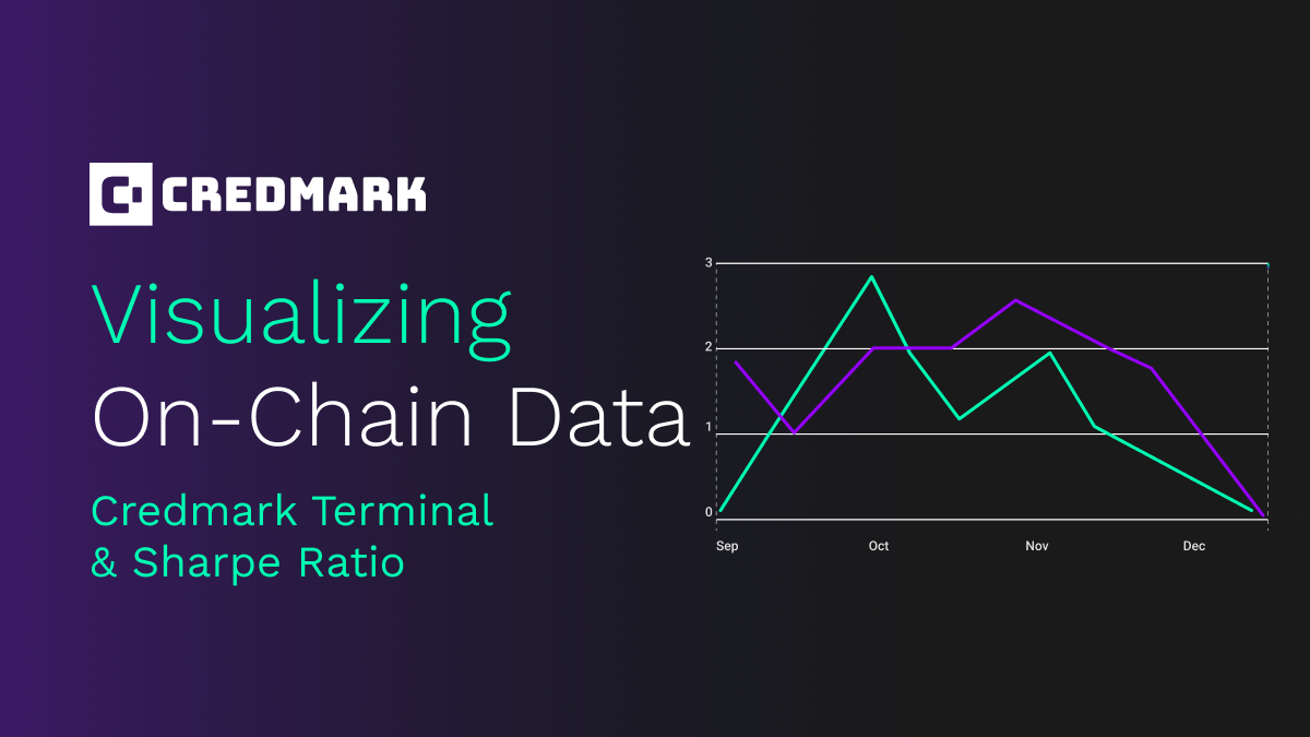
Visualizing On-Chain Data (Part 2)
The Credmark Terminal and Sharpe Ratio
Matthias Knauth
2022/12/12
As we pointed out in our last blog post, Credmark is all about producing and organizing data that we make available through our APIs. Moreover, it is important to us to give you examples and visualizations of this data in order to highlight the possibilities that lay beyond the raw data. Thus, this little series of posts will offer you some pathways to dig deeper into this data and spark your ideas to make use of it.
In Part 1, we took a deep dive into the Balance Ratio and how the recent events from the FTX meltdown can be traced in some on-chain metrics. Today in Part 2, we will look more closely at another important metric that is well-known in TradF: the Sharpe Ratio.
A short excursion into TradFi-metrics…
Okay,... we are not here to glorify the existing financial system. It is broken in many ways, and we need to build a better one! But…some of these folks came up with pretty good models and metrics to explain how this whole system works, and they did this a long time ago. Many have withstood the test of time. One of these modelers was Wiliam F. Sharpe who came up with the eponymous Sharpe ratio in 1966! The Sharpe ratio describes the risk-adjusted returns of an asset compared to a risk free asset. Generally speaking, riskier assets should yield higher returns to compensate for the additional risk, and the Sharpe Ratio is a way to measure that. Pretty cool, huh?
Let's dive into the math...
…on second thought, let’s not!
If you are a math geek, please visit our Credmark Wiki and explore how the formula is calculated. We spent a lot of time explaining the concept and how it is applied to DeFi.
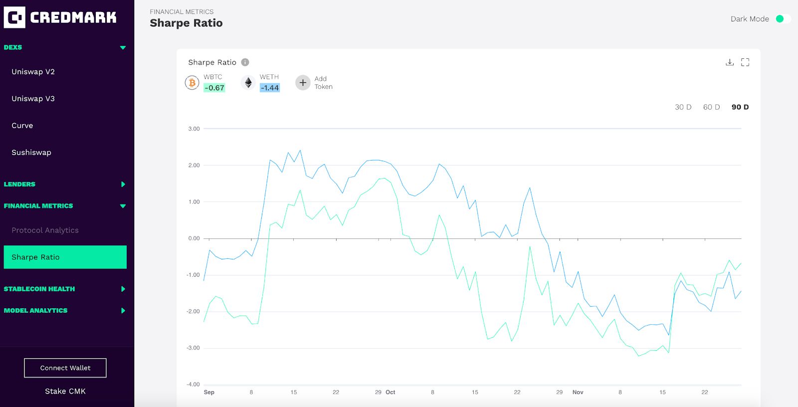
If you’re not a math geek, the Credmark Terminal will do this work for you and just show you the results. You only need to select the tokens of your choice and you will be able to compare their returns against each other. It is that simple. All you have to do is go to the Terminal and navigate to the Sharpe Ratio page.
...but I still don't get it!
Ok…yeah there are some weird graphs and numbers, but how will that help you? To recap, Sharpe Ratio is a number that allows comparison of different assets and portfolios in terms of risk-adjusted returns.
To put it even more simple:
- Number high - 👍
- Number low or negative - 👎
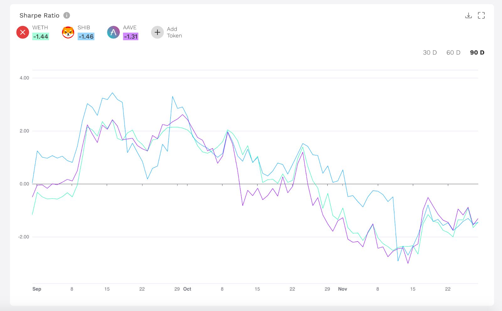
As a rule of thumb, Sharpe ratio numbers above 2.0 are considered very good, anything between 1.0 and 2.0 is acceptable and anything below 1.0 is considered bad. Thus, the Terminal gives you an easy option of selecting the tokens you like and comparing them over a period of time.
If you hold some ETH, SHIB and AAVE Token, you can easily track their numbers (Spoiler alert: they all performed pretty bad recently) but keep in mind that we look at very short timeframes of 30, 60 or 90 days here.
How to move on from there
Insight from the Sharpe Ratio can be implemented to evaluate if tokens are worth the risk. Do they perform dramatically better then some so-called risk-free assets like 10y Treasuries or are they even worse? This is a very important question, especially if you manage a big portfolio of different assets and tokens. The Sharpe ratio might be a useful indicator to identify tokens that are underperforming, especially if you combine them with other metrics like volatility. But we will leave this for you to decide.
Again…the Terminal proposes a use case for Credmarks data. It will not be perfect, it is just a demonstration of what you could do. It is not the ultimate truth you should base any financial decision upon but it should trigger your creativity and broaden the entrance into the DeFi rabbit hole.
About Credmark
Credmark runs a financial modeling platform powered by reliable on-chain data. We curate and manages DeFi data making it available via API and the Snowflake Marketplace around the globe and across industries.
Our community of quants, developers, and modelers actively build models for the DeFi community by leveraging our data API and tools. Join the growing community and together we will advance the next-generation financial system.

Sign up for our newsletter for the latest product updates, partnerships, and more.